Three years ago I wrote a post asking if Harriet Harman blogged her way to victory as the Labour’s deputy leader as my analysis of campaign websites used by candidates back then was that her online presence was the most interactive, and this could have contributed to her success as it demonstrated she was the best communicator out of the bunch.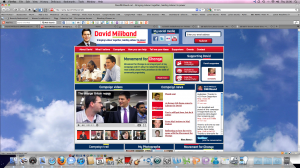
Social media has played a key role in this campaign for all the contenders; there was no Facebook or Twitter last time round for Harriet Harman and her rivals. All the candidates today – or their campaign teams – are switched on about social media sites, including Facebook, Twitter, blogs, videos, photo share and social bookmarking as part of their strategy. But some used it better it than others.
I’ve taken a peek at the web tools used by the five candidates in Labour’s leadeship contest – the results will be announced on Saturday – and just as the results are expected to be a close call between David and Ed Miliband, the same goes for which of the two brothers has the best campaign website. Even Political Betting can’t decide which brother will be the new Labour leader and says it’s 50-50 between them.
However, I think big brother David has the heads up with his web campaign and he has already proved himself to be a natural devotee of blogging as he the first minister to write a blog – first as Environment Secretary, and later Foreign Secretary. In my view,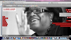
his campaign website is outstanding, attracting 358 comments on one post where he oulined ideas for his party’s renewal. On Twitter he had 34,002 followers and on Facebook there were 2,309 su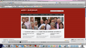 pporters. What I felt gave David the edge was his photostream of supporters and the use of Audioboo to play back podcasts which none of the other contenders had. He really used new technology so well.
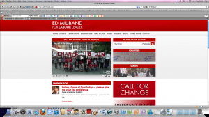
Brother Ed’s site was really slick too with lots of social tools, including a map, which his brother had too, showing their exhausting campaign route around the country. Both these brothers know how to use these campaign tools well.
Unfortunately, I wasn’t keen on the dialogue which instantly blared out when logging on to Diane Abbott’s, campaign website. I thought the home page looked messy with tabs on both sides and a large photo of her in the middle. I
couldn’t access any videos or pics from her site. Her blogs had few comments from supporters, and her last post was a cut and paste copy of an interview featured in The Morning Star.
I thought Andy Burnham tried really hard and came over as quite sincere. He comes third for his online presence, but I doubt this result will be transferred to the big count as he is not well known  enough. I was pleased to read that, like me, he believes long internships should not be exploitative , and that should win him some student votes.
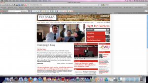
Ed Balls had lots of tag words displayed prominently on his home page which could have been played down, especially as the main feature here is his campaign blog, but this only shows two comments being left on three posts written by his team. However, you can discover Ed’s favourite Desert Island Discs. He might be heading off there next week….
Click on the images to see them enlarged.
Ed Miliband wins. I am stunned. I really thought David would. He beat brother David by the wafer thin margin of 50.65% to 49.35% after second, third and fourth preference votes came into play.